
Listen
- https://open.spotify.com/track/4FqnaZALqOYyWediiaAToi (open.spotify.com)
Guests: Car / Week
Episode summary: Today I want to talk about Susan Kare. Most of the inspiration this week in creating bitcoin++ design was derived from her. Who is she? One of the most important Macintosh artists of our time.
Today I want to talk about Susan Kare. Most of the inspiration this week in creating bitcoin++ design was derived from her. Who is she? One of the most important Macintosh artists of our time.
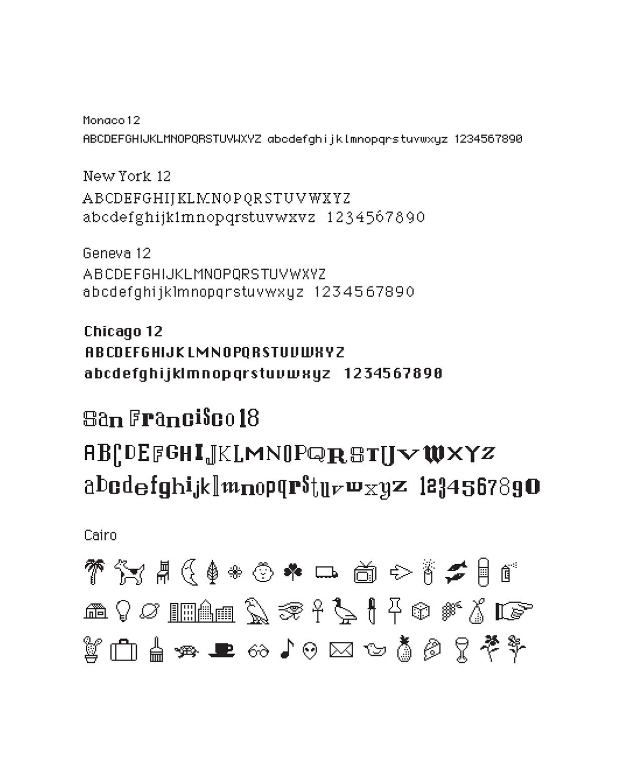
Susan Kare was a graphics artist before she ever got into computers. Susan started with Apple but went on to create design and iconography for AT&T, AutoDesk, Fossil, General Magic, Google, HP, Microsoft, PayPal, Pinterest, Nest, Oracle, Sony Pictures, Target, Xerox and many more. She was instrumental in creating early mac fonts, menu, icons and just about anything Andy Hertzfeld assigned her.
Her initial involvement with computer graphics arose when a former high school classmate, Andy Hertzfeld, invited her to apply for a part-time job at Apple. Hertzfeld was the programming wizard who, as a member of the original Macintosh development team, wrote most of the fundamental software for the new computer. Unlike earlier computers, the Macintosh featured a 'bitmapped' display in which each point of light, or pixel, on the screen was individually controlled by a single 'bit' of computer data. Creating icons and other graphic images was a matter of deciding which bits to turn on and turn off.
Communicating through images
At the time the classic mac user interface was black & white needing a human touch to bring it to life. Susan came into Apple at a perfect time she really took ownership of every domain she owned.
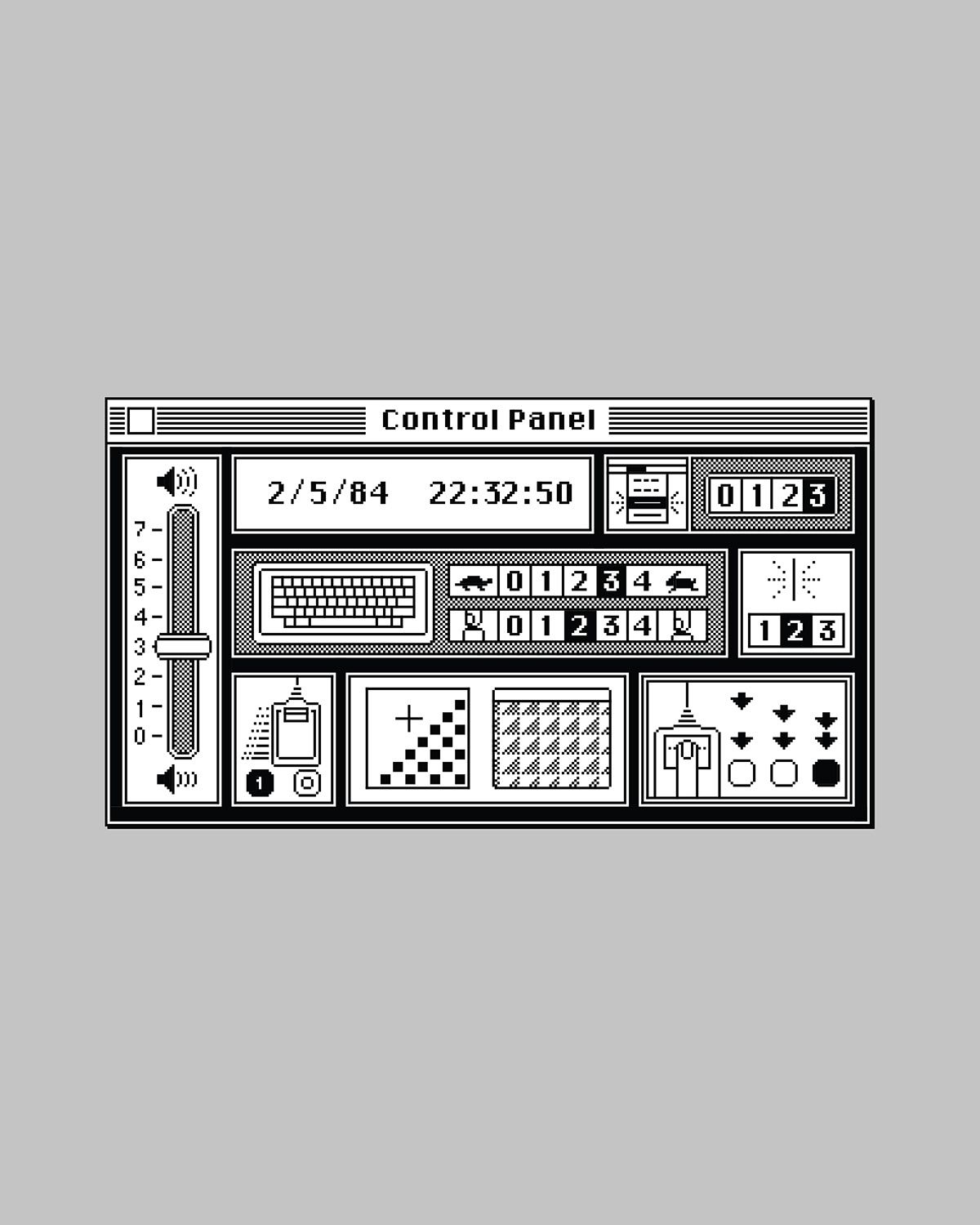
Andy Hertzfeld created an icon editor that she would use to design the icons, fonts and other graphic images. Each Macintosh icon at the time consisted of a grid of 30 pixels by 30 pixels or the equivalent of 900 dots in all.
Susan's Goals for the Mac User Interface
- Your mom could use it
- Like arcade games-no manuals
- Friendly
Why go down this rabbit hole?
Like I said to start this post, I've been hard at work creating bitcoin ++ design and one of the key aspects in creating the website was focusing in on the iconography of early Apple computers. Usually when I go down these artistic rabbit holes I like to do a little research on the artist who made it come to life. It gets me in the right mindset to understanding their stroke of the brush per se. Wrapping my mind around her mindset helped get me there creatively. Knowing how another artist creates including there approach is the best way to get the most out of any project design you are chasing. Always go down those dead end design rabbit holes its all apart of the process.
The less detail the more universal. Make things that are simple so you don't exclude anybody. - Susan Kare
Fun Fact: Current pixel designs of today are really just depictions of mosaic artwork that go back centuries.

The most important thing I learned this week about Susan Kare is she cared more about getting things done efficiently as opposed to how things fundamentally worked. Its clear as day now that the ease of use and sensibilities of the Mac came from her.
My fav track this week. See ya next week Plebs.✌️